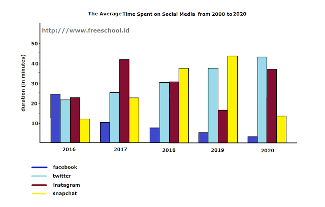
Today, we are going to learn how to describe a bar graph in IELTS Writing Task 1. Bar graph is a little bit easier to explain for various reasons, but the main reason why it is so easy to explain is because the general pattern is more obvious. To demostrate how it's done, we are going to use a sample bar graph below:
In 2016, people on twitter spent around 20 minutes a day using the app. Every year, the duration slightly increased by 5 minutes until it reached its peak at the end of the period, in which users nearly spent 45 minutes a day. As for facebook, it used to be a social media platform with the longest duration spent by its users. But, the number witnessed a sharp decrease in 2017, and kept experiencing a slight decline from that point on.
Moving to snapchat, the duration spent on this platform used to be the shortest among other apps, just a little below 15 minutes a day. However, people spent more time using the app and by the year 2019, as they used it for nearly 45 minutes a day. Instagram had the second longest duration of roughly 20 minutes a day in 2016. A year later, its users spent more than forty minutes daily. In the next two years, the duration spent on instagram decreased to half an hour and 20 minutes respectively. At the end of the period, people spent nearly forty minutes using instagram.
 |
| sorry if it looks a little messy |
Here is how I explain the bar graph above:
The bar graph compares the amount of time that people spent on facebook, twitter, instagram and snapchat in a five-year period staring in 2016. The data indicates that people were spending more time on twitter, while facebook users spent less and less time over the period. In general, the total duration spent on using snapchat steadily increased, while the total duration on instagram considerably varied.
In 2016, people on twitter spent around 20 minutes a day using the app. Every year, the duration slightly increased by 5 minutes until it reached its peak at the end of the period, in which users nearly spent 45 minutes a day. As for facebook, it used to be a social media platform with the longest duration spent by its users. But, the number witnessed a sharp decrease in 2017, and kept experiencing a slight decline from that point on.
Moving to snapchat, the duration spent on this platform used to be the shortest among other apps, just a little below 15 minutes a day. However, people spent more time using the app and by the year 2019, as they used it for nearly 45 minutes a day. Instagram had the second longest duration of roughly 20 minutes a day in 2016. A year later, its users spent more than forty minutes daily. In the next two years, the duration spent on instagram decreased to half an hour and 20 minutes respectively. At the end of the period, people spent nearly forty minutes using instagram.


No comments:
Post a Comment