IELTS Writing Task 1 - Combined Graphs (Pie Chart and Table)

In the previous lesson, we have learned how to describe bar graph and line graph in IELTS Writing Task 1. Now, we are going to learn how to describe another combined graphs, which are pie chart and table. Take a look at a sample diagram below.


IELTS Writing Task 1 - Combined Graphs (Bar Graph and Table)

IELTS Writing Task 1 - Combined Graphs (Pie Chart and Table)


We are going to explain the two graphs in two separate paragraphs, so the writing structure of the combined graphs can be explained as follows:


Paragraph 1

  • Introduction
  • Explaining variables
  • Explaining major trend

Paragraph 2

  • Giving detailed information of major trend 1 (percentage, proportion, lowest/highest, increase/decrease)

Paragraph 3

  • Giving detailed information of major trend 2 (percentage, proportion, lowest/highest, increase/decrease)


Paragraph 1

Introduction

As usual, we have to  give a very general introduction by paraphrasing the original titles. Take a look at an example below.

  • The number of college students who attend sporting events (pie chart original title)

  • Various sporting events attended by college students (table original title)

  • The pie chart explains the proportion of students watching sport competitions while the table compares students' attendance in such events based on gender (paraphrased title).

Explaining Variables

After introducing both graphs, we need to explain variables such as year, place, units of measurement, etc. Take a look at an example below.

There are 500 students taking part in the survey. Units are presented in percentage.

Explaining Major Trend

Here, we have to see the general pattern of the data. Because we separate the data into two different paragraphs, we can use the trend as the main idea of those paragraphs.

Major Trend 1 (pie chart)

  • The pie chart indicates that the majority of students being surveyed do not go to sporting events.

Major Trend 2 (table)

  • The data also shows that there are more male students attending sporting events, many of whom watch football match. 

  • A significant number of female students watch tennis match.

The first paragraph of the our IELTS Writing Task 1 will be as follows:


The pie chart explains the proportion of students watching sport competitions while the table compares students' attendance in such events based on gender. There are 500 students taking part in the survey. Units are presented in percentage.


Paragraph 2

In paragraph 2, we will give a very detailed explanation on the pie chart based on the first major trend. Take a look at an example below.


The pie chart indicates that the majority of students being surveyed do not go to sporting events. Of a total 500 students that participate in the survey, only one-fifth attend sporting events.


Paragraph 3

In paragraph 3, we are going to explain the tables based on the second major trend. Take a look at an example below.


The data also shows that there are more male students attending sporting events, many of whom watch football match. Of a total 57 male participants, nearly 34 of them watch football. Basketball is the second most favorite sporting events attended by 10 males. The other three sporting events are attended by a small number of male participants. As for the female population, more than a half watch tennis match. Basketball also becomes the second most favorite sporting event for females, attended by 10 individuals. Unlike their male counterpart, females do not like watching football, except for one person.


The whole writing will look like this.


The pie chart explains the proportion of students watching sport competitions while the table compares students' attendance in such events based on gender. There are 500 students taking part in the survey. Units are presented in percentage.

The pie chart indicates that the majority of students being surveyed do not go to sporting events. Of a total 500 students that participate in the survey, only one-fifth attend sporting events.

The data also shows that there are more male students attending sporting events, many of whom watch football match. Of a total 57 male participants, nearly 34 of them watch football. Basketball is the second most favorite sporting events attended by 10 males. The other three sporting events are attended by a small number of male participants. As for the female population, more than a half watch tennis match. Basketball also becomes the second most favorite sporting event for females, attended by 10 individuals. Unlike their male counterpart, females do not like watching football, except for one person.

Wordcount: 167


IELTS Writing Task 1 - Combined Graph (Line Graph & Bar Graph)

In the previous article, we have discussed how to explain the combination of pie charts and bar graph. Today, we are going to continue the discussion for IELTS Writing Task 1 combined graphs. Take a look at a sample graph below.

IELTS Writing Task 1 Combined Graph (Line Graph & Bar Graph)


The writing structure for sample graphs above is as follows:


Paragraph 1

  • Introduction
  • Explaining variables
  • Explaining major trend

Paragraph 2

  • Giving detailed information of major trend 1 (percentage, proportion, lowest/highest, increase/decrease)

Paragraph 3

  • Giving detailed information of major trend 2 (percentage, proportion, lowest/highest, increase/decrease)


Remember that when describing combined graphs we can also use this writing structure:


Paragraph 1

  • Introduction
  • Explaining variables
  • Explaining major trend

Paragraph 2

  • Giving detailed information of the first graph (percentage, proportion, lowest/highest, increase/decrease)

Paragraph 3

  • Giving detailed information of the second graph (percentage, proportion, lowest/highest, increase/decrease)


For now, I would like to focus on how we explain the two graphs in two separate paragraphs (instead of separating the two paragraph based on the major trend). Here's how we describe the sample graph above:


Paragraph 1


Introduction

As usual, we have to introduce the graph by paraphrasing the original title, which can be done as follows:

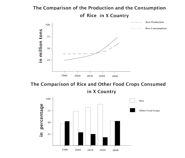
  • The comparison of the production and the consumption of rice in X country (line graph original title)

  • The comparison of rice and other food crops consumed in X country (bar graph original title)

  • The line graph compares X country's domestic production and consumption of rice in forty years starting from 1990, while the bar graph compares the consumption of rice and other staples (paraphrased title) 

Explaining Variables

There are a number of variables that we have to explain in the first paragraph, two of which (year and country) have been explained in the first sentence. SO now, we only have to explain the unit of measurement, which can be written like this:

  • Units are measured in million tons

Explaining Major Trend

Although the two graphs are explained separately in two different paragraphs, we still have to use the major trend as the main idea of each paragraph, and it can be written as follows:

  • The line graph indicates that both rice production and consumption increases throughout the period (the main idea for paragraph 2)

  • It can be seen from the bar graph that unlike the consumption of rice, the amount of other produces tends to decrease (the main idea for paragraph 3)

So far, the first paragraph of our writing task 1 will look like this:


The line graph compares X country's domestic production and consumption of rice in forty years starting from 1990, while the bar graph compares the consumption of rice and other staples. Units are measured in million tons.


Paragraph 2

In paragraph 2, we have to give a more detailed explanation which can be done as follows:


The line graph indicates that both rice production and consumption increases throughout the period. The consumption of rice does not undergo any significant change from 1990 until 2020, during which around 37 million tons of rice is consumed. However, the domestic consumption of rice was way higher than the production. In 1990, there was a deficit of 12 million tons of rice. It took 25 years for the production and consumption to reach an equilibrium. From this point on, the production of rice is predicted to be higher than consumption and will reach its highest point of more than 75 million tons in 2040. The consumption of rice will also increase and reach 62 million tons in 2040.


Paragraph 3

In paragraph 3, we also have to give detailed information, which can be done as follows:


It can be seen from the bar graph that unlike the consumption of rice, the amount of other produces tends to decrease. In 1990, the consumption of other staples was just a little above 50%.Ten years later, the number was almost reduced by a half. The consumption other staples continued to decrease by 1% twenty years later. In 2040, it is estimated that there will be a balanced consumption of rice and other produces.


The whole writing will be like this:


The line graph compares X country's domestic production and consumption of rice in forty years starting from 1990, while the bar graph compares the consumption of rice and other staples. Units are measured in million tons.

The line graph indicates that both rice production and consumption increases throughout the period. The consumption of rice does not undergo any significant change from 1990 until 2020, during which around 37 million tons of rice is consumed. However, the domestic consumption of rice was way higher than the production. In 1990, there was a deficit of 12 million tons of rice. It took 25 years for the production and consumption to reach an equilibrium. From this point on, the production of rice is predicted to be higher than consumption and will reach its highest point of more than 75 million tons in 2040. The consumption of rice will also increase and reach 62 million tons in 2040.

It can be seen from the bar graph that unlike the consumption of rice, the amount of other produces tends to decrease. In 1990, the consumption of other staples was just a little above 50%.Ten years later, the number was almost reduced by a half. The consumption other staples continued to decrease by 1% twenty years later. In 2040, it is estimated that there will be a balanced consumption of rice and other produces.

Wordcount: 228 words